The Brand Story
Created for the Puzzler
Some people see a thousand pieces. Others see a thousand moments of possibility.
Grateful House was created with the puzzle enthusiast at its heart.
The vision was to build a premium jigsaw puzzle brand that celebrates the enjoyment of puzzling while placing exceptional quality at the centre of the experience.
From the artwork and packaging to the details that accompany each puzzle, the brand was developed around the needs and expectations of people who genuinely love jigsaw puzzles.
Grateful House is about more than completing a picture. It's about enjoying every piece of the journey.
The Creative Direction
Where Quality Meets Creativity
The brand was designed to balance premium presentation with the colourful, imaginative world of jigsaw puzzles.
Rather than allowing the branding to compete with the artwork, the visual identity was deliberately kept clean and sophisticated.
This creates a recognisable brand while allowing each puzzle illustration to take centre stage.
Behind the Logo
The GH Monogram
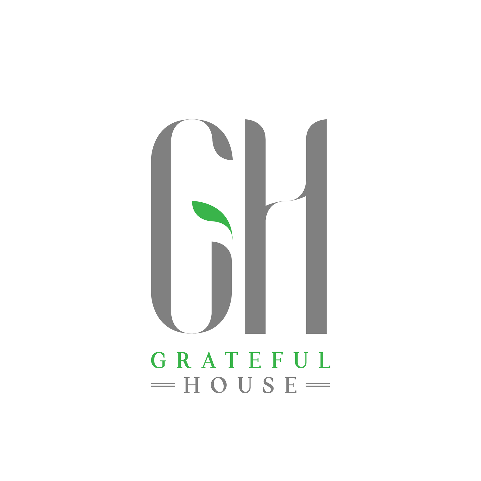
The identity features an elegant GH monogram with elongated letterforms and a subtle green leaf.
The black, white and green palette creates a distinctive visual signature.
The GH monogram creates brand recognition, while the refined typography communicates quality.
The green leaf introduces freshness and an organic element. The minimalist identity allows colourful puzzle artwork to remain the focus.
- The GH monogram creates brand recognition
- The refined typography communicates quality
- The green leaf introduces freshness and an organic element
- The minimalist identity allows colourful puzzle artwork to remain the focus
- BlackThe requested logo presentation background
- WhiteThe supplied logo background and product backdrop
- Leaf greenSampled from the leaf and GRATEFUL lettering
- Monogram greySampled from the supplied GH monogram and HOUSE lettering
Green and grey values are sampled from the supplied logo. The original TIFF has a white background and grey lettering; both are preserved unchanged inside the black presentation frame.
The Product Experience
Thoughtfully Designed. Beautifully Presented.
The visual identity extends beyond the logo and into the overall product presentation.
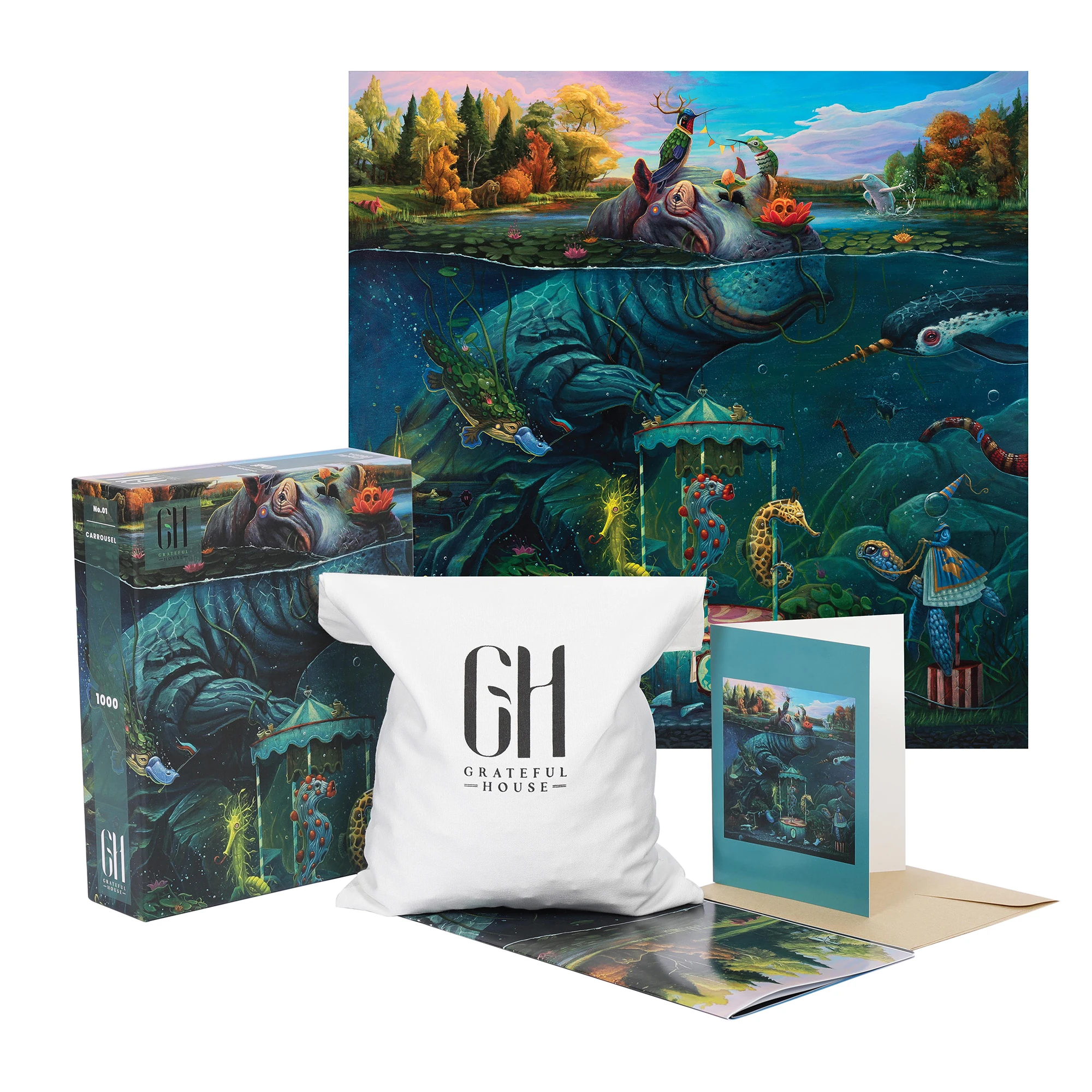
The coordinated packaging, artwork and branded accessories help create a cohesive experience from opening the box to completing the puzzle.
- The Carousel 1,000-piece puzzle box
- The colourful puzzle artwork
- The Grateful House branded puzzle bag
- The illustrated booklet
- Additional presentation materials
The Artwork
Every Puzzle Tells a Story
The colourful, imaginative illustration contrasts beautifully with the restrained Grateful House branding.
The brand identity was designed to complement the artwork rather than overpower it.
The Thinking Behind the Design
Designed Around the Experience
Grateful House was created around the belief that puzzle enthusiasts appreciate thoughtful details.
The creative direction focused on presenting the product as a premium experience rather than simply another puzzle on a shelf.
From the distinctive monogram to the illustrated packaging and branded accessories, each element works together to create a recognisable and cohesive brand.
The Final Creation
Made for the Love of Puzzling.
Grateful House combines premium positioning, imaginative artwork and thoughtful product presentation.
The result is a distinctive jigsaw puzzle identity designed with the enthusiast in mind.