The Brand Story
A Fighting Spirit. A Happy Ending.
Every fighter knows the feeling.
The nerves before the bell. The discipline behind the training. The determination to keep going when things get tough.
And then comes the satisfaction of knowing you've given it everything.
That's the spirit behind Happy as Larry.
The brand draws inspiration from the famous Australian expression "Happy as Larry", meaning extremely happy or content.
One popular theory connects the expression to Larry Foley, a celebrated undefeated Australian boxer from the 19th century.
Although the exact origin of the saying remains uncertain, the possible boxing connection provided a distinctive creative direction for the brand.
The result is an Australian-inspired boxing accessories identity that combines sporting heritage, strength and personality.
The Creative Vision
Old-School Boxing. Timeless Character.
Rather than following the aggressive, modern aesthetic commonly associated with boxing brands, Happy as Larry takes inspiration from traditional boxing posters, historic sporting advertisements, hand-painted signage and vintage hand-illustrated artwork.
The identity was designed to feel like something discovered in an old boxing gym — full of history, personality and character.
The goal was to create a brand that celebrates boxing's heritage while remaining distinctive and relevant today.
Behind the Branding
The Primary Logo
The complete primary logo combines bold, old-fashioned boxing typography with traditional hanging gloves and detailed hand-engraved linework.
Arched HAPPY AS lettering, the distressed red LARRY wordmark and navy BOXING create a compact vintage composition with the confidence of a classic sporting poster.
Deep navy and vintage red sit on aged cream, while the distressed finish preserves the character of historic printed advertisements. The original artwork is presented complete and unchanged.
- Large vintage lettering inspired by historic sporting headlines
- Deep navy and vintage red typography
- Traditional hand-engraved boxing gloves hanging beneath the lettering
- A complete HAPPY AS LARRY BOXING composition
- Distressed, weathered print detailing
- An aged cream poster background
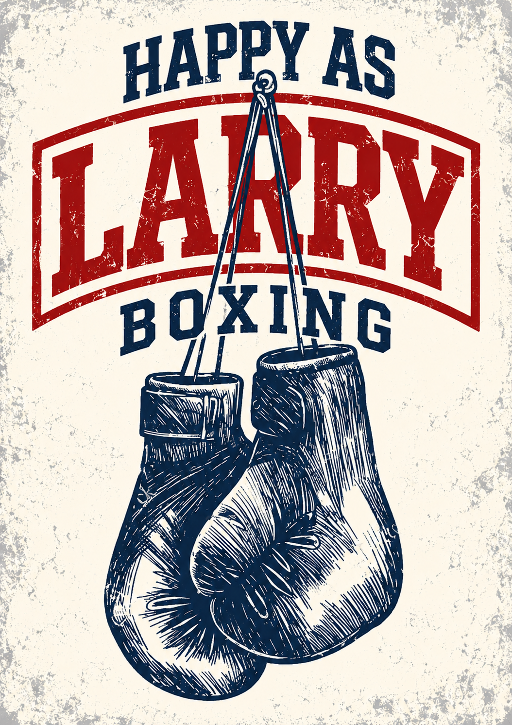
- Deep navyThe lettering and hand-engraved boxing gloves
- Vintage boxing redThe LARRY wordmark and its sweeping frame
- Aged creamThe nostalgic poster background
- WhiteA clean presentation background for the secondary mark
Navy, red and cream are sampled from the supplied primary artwork — approximate values. White is used as a clean presentation background for the transparent secondary mark.
The Brand Mark — A Symbol of Boxing Heritage
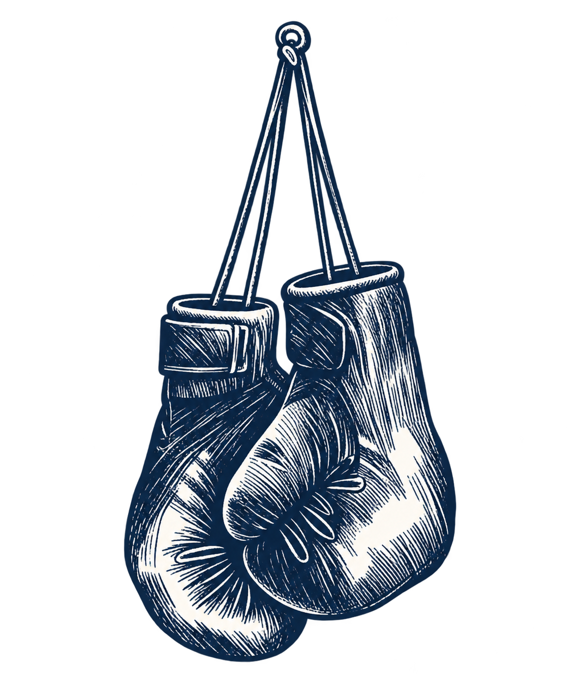
The standalone boxing glove illustration gives Happy as Larry a recognisable identity beyond its name. Inspired by traditional boxing illustrations and vintage sporting artwork, the design celebrates the history, character and craftsmanship associated with the sport.
Its detailed engraved appearance reinforces the brand's nostalgic identity, while its simple navy colour allows it to be used across boxing accessories, apparel, packaging and promotional materials.
One Brand. Two Distinctive Marks.
Together, the two designs create a flexible visual identity suitable for different applications. The primary logo carries the complete personality of the brand, while the secondary mark provides a recognisable symbol where a simpler standalone illustration is needed.
Typography
The bold, expressive lettering is inspired by old-fashioned sporting headlines and hand-painted advertisements.
Its distressed finish creates character and reinforces the brand's connection to boxing heritage.
The Thinking Behind the Design
More Than a Name.
The creative concept connects the meaning of a familiar Australian expression with the discipline and determination of boxing.
Happy as Larry represents the satisfaction that follows hard work, training and personal achievement.
The vintage design celebrates the sport's history while giving the brand a memorable and approachable personality.
Brand philosophy: "Train hard. Stay humble. Enjoy the fight."
Brand Applications
The identity is built to carry the same vintage character from a glove's backing panel to a gym wall, keeping the primary wordmark and the standalone glove mark legible wherever the brand appears.
The applications below are conceptual branding directions for the identity — they are not photographs of manufactured products.
- Boxing gloves
- Hand wraps
- Training bags
- Apparel
- Product packaging
- Gym signage
The Final Identity
Built for the Fight. Made for the Feeling.
Happy as Larry brings together Australian character, boxing heritage and vintage-inspired design.
The identity is bold, recognisable and full of personality, created to feel equally at home on boxing equipment, apparel and traditional sporting merchandise.